你不知道的 CSS 之包含块
百分比宽高与绝对定位偏移到底相对谁算?搞懂 containing block 与初始包含块,布局阶段的几何信息才说得清。
你不知道的 CSS 之包含块
盒模型、border-box 很多人熟,但 包含块(containing block) 一听就懵——它平时「看不见」,却决定 width: 50%、left: 10px 相对谁算。
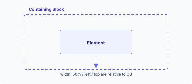
简单说:元素的尺寸与位置(以及百分比值的计算)受包含块影响。 规范见 CSS2 containing block。
在 浏览器布局阶段,几何信息就是结合 DOM、Computed Style 与包含块算出来的;样式计算 里算不定的百分比宽高,到这一步才定稿。
最简例子:50% 相对谁?
<body>
  <div class="container">
    <div class="item"></div>
  </div>
</body>
.container {
  width: 500px;
  height: 300px;
  background-color: skyblue;
}

.item {
  width: 50%;
  height: 50%;
  background-color: red;
}
item 是 250×150?对。但更准确的说法是:百分比相对包含块。这里包含块是最近祖先块容器的 内容区(content box)——即 container 的内容区 500×300,50% 才是 250×150。
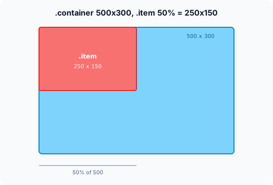
平时说「相对父元素宽高」多半没错,但严谨表述是 相对包含块。
初始包含块
根元素 html 的包含块叫 初始包含块(initial containing block):
- 大小通常等于 视口(viewport)
- 原点在视口左上角
- 是 绝对定位、固定定位 的重要参照
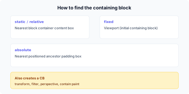
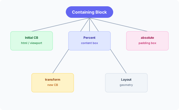
非根元素:怎么找包含块?
position | 包含块由谁建立 |
|---|---|
static / relative | 最近 块容器 的 内容区 边缘 |
fixed | 视口(初始包含块) |
absolute | 最近 position 不为 static 的祖先的 padding 区 边缘 |
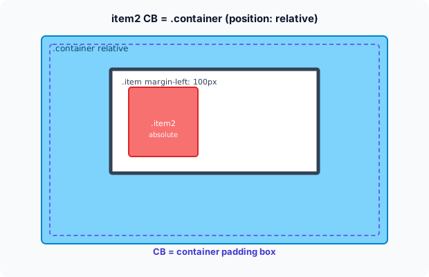
absolute 不看「父元素」,看「定位祖先」
<body>
  <div class="container">
    <div class="item">
      <div class="item2"></div>
    </div>
  </div>
</body>
.container {
  width: 500px;
  height: 300px;
  background-color: skyblue;
  position: relative;
}

.item {
  width: 300px;
  height: 150px;
  border: 5px solid;
  margin-left: 100px;
}

.item2 {
  width: 100px;
  height: 100px;
  background-color: red;
  position: absolute;
  left: 10px;
  top: 10px;
}
item2 的包含块是 container(有 position: relative),不是中间的 item:
transform 也会建立包含块
absolute / fixed 的包含块还可能是满足下列条件的 最近祖先的 padding 区:
transform/perspective不是nonewill-change为transform或perspectivefilter不是none(或 Firefox 下will-change: filter)contain: paint
给 item 加上 transform: rotate(0deg):
.item {
  transform: rotate(0deg);
}
包含块变为 item 自身:
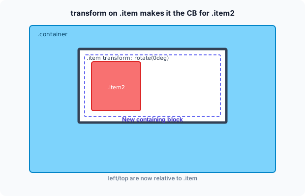
这也是 transform 常和层叠、合成一起讨论的原因——不仅影响包含块,还影响 分层与绘制。
规范例题
<html>
  <head>
    <title>Illustration of containing blocks</title>
  </head>
  <body id="body">
    <div id="div1">
      <p id="p1">This is text in the first paragraph...</p>
      <p id="p2">
        This is text
        <em id="em1">
          in the
          <strong id="strong1">second</strong>
          paragraph.
        </em>
      </p>
    </div>
  </body>
</html>
无额外 CSS 时:
| 元素 | 包含块 |
|---|---|
| html | 初始包含块 |
| body | html |
| div1 | body |
| p1、p2 | div1 |
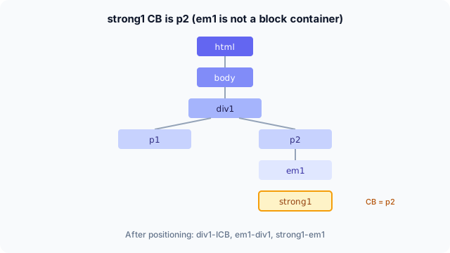
| em1 | p2 |
| strong1 | p2 |
strong1 的包含块是 p2 而非 em1,因为 em1 不是 块容器;规则要求 最近的块容器 的内容区。
加上:
#div1 {
  position: absolute;
  left: 50px;
  top: 50px;
}
div1 的包含块变为 初始包含块(body 仍是 static,向上找不到定位祖先):
| 元素 | 包含块 |
|---|---|
| div1 | 初始包含块 |
| p1、p2 | div1 |
再给 em1 定位:
#em1 {
  position: absolute;
  left: 100px;
  top: 100px;
}
| 元素 | 包含块 |
|---|---|
| em1 | div1 |
| strong1 | em1 |
更多示例见 MDN:Containing block
小结
- 包含块 决定百分比与定位偏移的参照区域,不是笼统的「父元素」。
static/relative看最近块容器的 内容区;absolute看定位祖先的 padding 区;fixed看视口。transform等属性会 新建包含块,布局结果可能「突然变了」。- 布局阶段算几何信息时离不开包含块;改样式触发的 reflow 见 reflow 与 repaint。